A Reflection on Luis Alberto Urrea’s visit to Towson University
By: Gel Derossi, Online Creative Nonfiction Editor
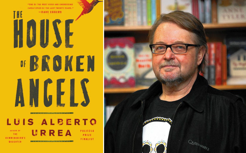
When Luis Alberto Urrea visited Towson University, his vivid presence as a storyteller blurred lines of performance and identity. It is absolutely no wonder that the first thing you’ll find on Mr. Urrea’s “About” page on his website is NPR’s designation of him as a “master storyteller with a rock and roll heart.”
In his books, Mr. Urrea unearths lives that have been buried. His writing is what he calls “bearing witness.” In the masterclass he held at Towson, he told us about—or, more accurately, performed—his own experiences that culminated into his identity as a storyteller. As he came to understandings he had not had before, he recognized the truths that his unique background uncovered and their need to be told. Sitting among students in a tightly-packed classroom, Mr. Urrea brought us with him into his past. He expressed intimately the story of his father’s unjust and tragic death. He confided in us. He trusted us with the responsibility of knowing the importance of his brother’s influence in The House Of Broken Angels, a novel written after his brother’s death. Mr. Urrea’s way of storytelling draws listeners into a lifelong promise.
He expertly weaves emotion and surprising humor in stories that sing of the lives of immigrants, Native people, women, and other folks who have been too often overshadowed by the dominant minority. The drive of Mr. Urrea’s life, as he made clear to us, is amplifying the voices of the influencers, the voices of the people who gave their love and passion and received nothing in return. That rock and roll heart beats for the lives of the oppressed, just like the music genre of the same name.
Luis Urrea brought to my attention the importance of your own story. It is already weaved intimately in the oppressed voices that call to writers. In class, one student asked about writing someone else’s story as a person who has not experienced what they have. Mr. Urrea asked us to do our due diligence in getting another’s story right. He handed the words to us like bricks we could use to build ourselves. Chuckling, he told us how he had once asked renowned indigenous author Linda Hogan to write The Hummingbird’s Daughter, a now-published novel with deep Native American and Mexican roots. He claimed his mind was too Western to write it himself. She waved her hand peacefully, and then she replied to him, “The Western mind is a fever. It will pass.”
The act of bearing witness can transcend our barriers if we commit with respect and love. Not only can this apply to others’ stories, our own stories deserve that due diligence, too.
The day Mr. Urrea came to Towson was a day I noticed my mind lost some grounding with reality. It may seem like a simple thing. About two months into the school semester was when Mr. Urrea held his masterclass, and I decided my regular class started at 4:00 (it actually started at 3:30). Conveniently, Mr. Urrea’s talk was scheduled until 3:45, and then I stayed until 4:00 as it ran over. I thought I’d only be a few minutes late, not a half hour. I came to understand that my own mind had tricked me. It has happened often, and it is always unnerving when it does. There have been times when I needed my memory. I needed to rely on it, to be there for the people who I care about most, who were depending on my memory in one of the most literal forms you might experience. I was a witness for the rape of someone I love. During pre-trial interviews, they asked me to recount what had happened. Instead of answering truthfully, faced with a gathering of legal workers, my vision blacked out, but I didn’t stop functioning. I ended up telling the story of my own rape, for the first time.
They dismissed me from the case. I was the only witness. I know it’s not my fault, and that this is the justice system we live with—but the rapist was charged for his drug possession, not for the rape. The justice system itself told someone I love that their rape didn’t happen, that their feelings were invalid. If I had been able to articulate and process my story before that moment, maybe I’d have been able to tell the victim’s. Perhaps telling my story in that moment wouldn’t have mattered. Telling our stories, and integrating our stories into the narrative and the understanding of our society, will.
Another revolutionary author, bell hooks, excavates in her fist-pumping title, Rock My Soul: Black People And Self Esteem, that the way in which we act and behave, especially in life’s throes of mundanity, has a crucial effect on our mental health and identity. During the masterclass, Mr. Urrea shared with us a lesson: an entire life is a river, and its tightest bends are where you’ll find the stories, where something either must change or must fail. The choice between embracing our story or suppressing it is in the ordinary, everyday choices and bends that we face. Building ourselves and our identities is in any opportunity to express and perform your story, your thoughts, your feelings.
***
Photo courtesy of Towson University
It’s okay to not feel creative in quarantine
By: Bailey Hendricks, Marketing & Publicity Director
With more time on your hands during quarantine, you may feel some pressure to write a poem, make art, finish your manuscript, or generally be productive. I, for one, have been feeling some of this pressure myself.
It seems like since we are home, we should be “making the most out of this time.” If the pressure you’re feeling is not to finally finish that poem and submit it to a lit mag, maybe it’s wanting to clear out that junk drawer or finally organize all of your take-out menus. Whatever guilt you’re feeling for not being as productive as you’d like, take a moment to try to release that guilt. Understand that these are unprecedented and uncertain times. You shouldn’t add that extra pressure on yourself.
Make time to do things that give you the most comfort. Maybe that’s sipping on some tea, putting your feet up, and reading a good book. Or, maybe it’s making some chocolate chip cookies, or painting your nails, or just taking an extra-long, extra-hot shower.
Whatever activity gives you the most comfort is what you should be putting your energy into right now. We are all going through a collective traumatic experience, all around the world. It’s normal if you’re unable to focus, are sleeping more, or even are snacking more than usual. Be gentle with yourself during this time and seek comfort in the little things.
Baltimore, I actually like it! By Natalie Jeffery
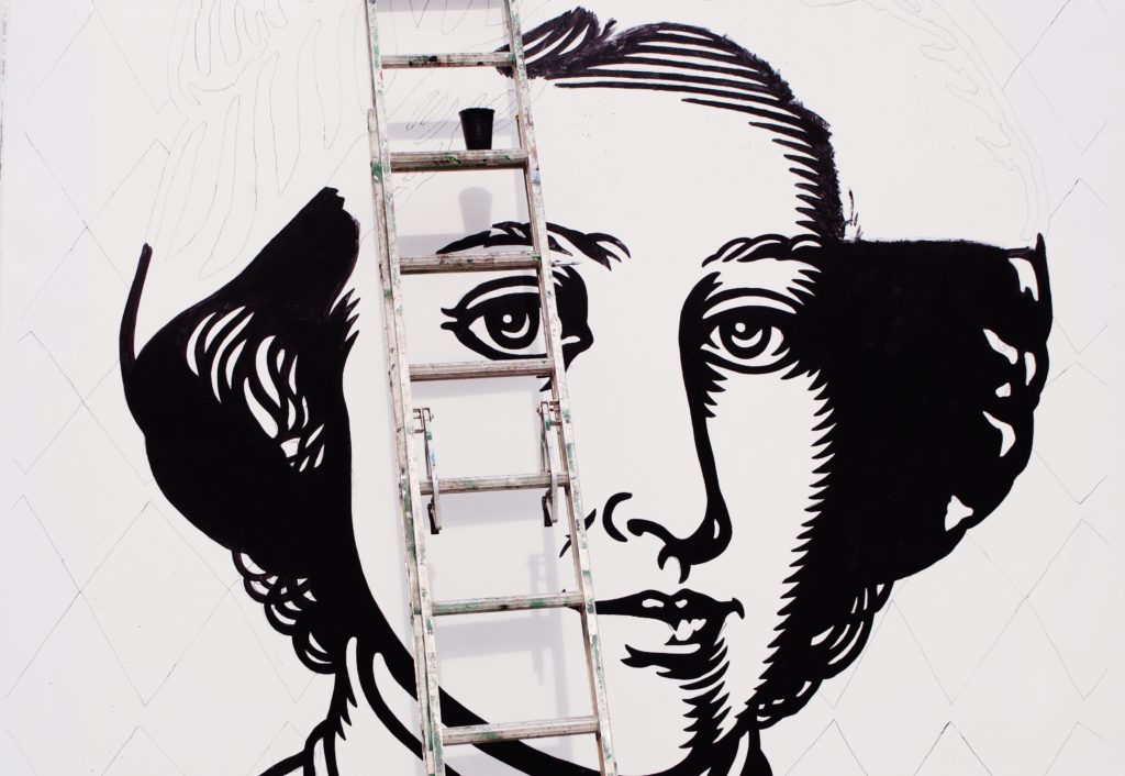
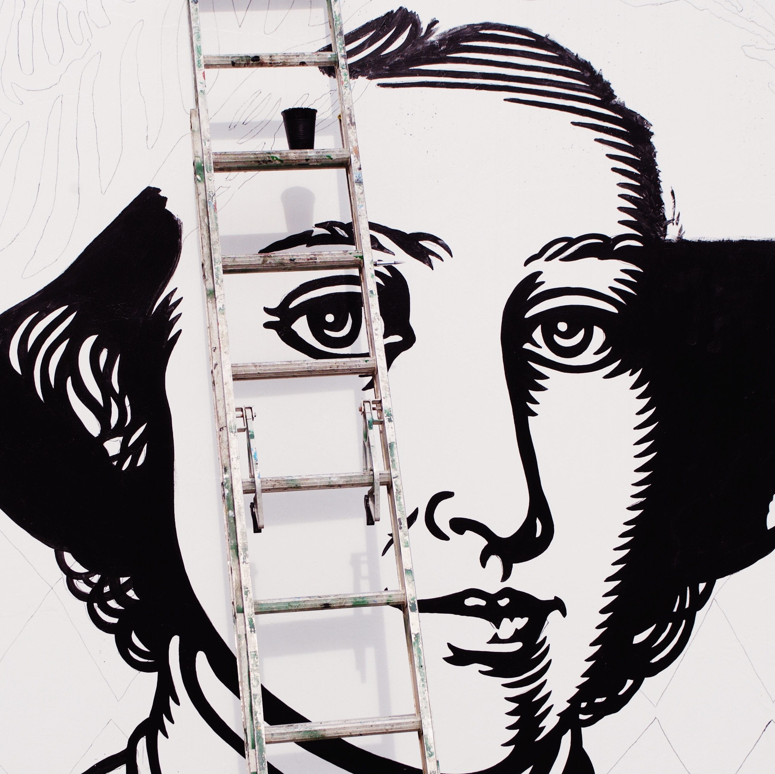
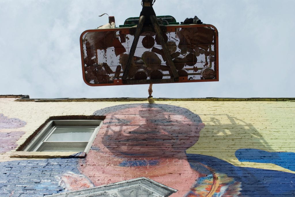
The photo above was taken on West North Avenue in Baltimore City—right outside of Mondawmin. I was pursuing a photo series of the artist Iandry, a 2009 MICA graduate whose art decorates the city. He was painting the “Wall of Wisdom,” a mural which consists of six portraits of historical change makers: Frederick Douglass, Matthew Henson, Fanny Coppin, Robert W. Coleman, William S. Baer, and St. Elizabeth Ann Seton. I would travel into the city twice a week to document the progress of the mural—an experience that was never dull. Each visit, I would watch Iandry encourage community members to get involved in the painting process. Passersby would be given a few simple instructions, and minutes later they were a part of this beautiful masterpiece. He would receive kind words flying out of car windows, gracious thank-you’s from those walking down the street, and an overall approval from the community. I remember him saying once that art doesn’t change people, but it can inspire people to make the changes they want for themselves.
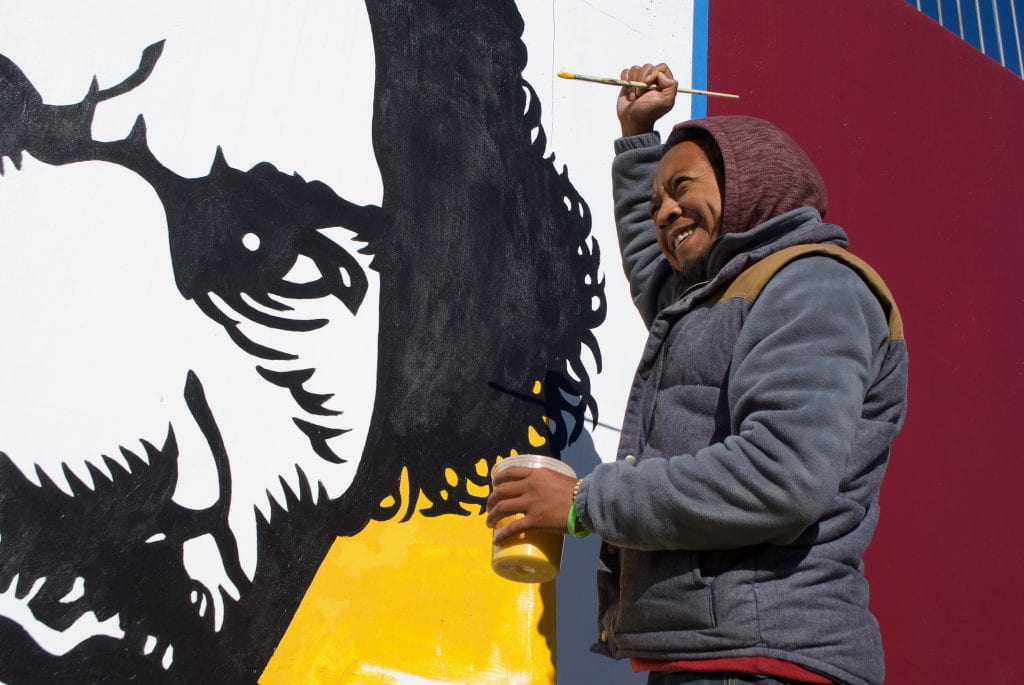
Baltimore City, often considered to be a not-so-nice place by outsiders and even some insiders, holds a lot of beauty in my eyes. My love for the city was planted my junior year of high school when I began working at a restaurant in Federal Hill. Before anyone calls me out, being exposed to this one type of neighborhood didn’t allow me to truly claim love for the city yet. It wasn’t until my sophomore year of college, when I started dating someone who had spent their whole life in Baltimore City, that I began exploring it in a whole new way. Infatuation with the start of my relationship and newfound friends led me to be intoxicated with excitement every time I had a chance to go to Baltimore; suddenly Towson was of complete disinterest to me.
I began to learn and come to know more neighborhoods—Charles Village, Remington, Hampden, Fells Point… Some of which are definitely in the process of being gentrified. But, nonetheless, my love was expanding. It was then that I found myself becoming very defensive over those who only saw Baltimore as a crime-ridden, “ghetto” place. My best friend recently had a conversation with someone she graduated with. She stated that she was planning on moving to Baltimore, and his response was, “Oh, you’re moving to the ghetto!” Both of us were completely awestruck by the sheer ignorance of his statement. Media coverage of Baltimore does an unjust job at countering the bad with the good—I suppose that goes for everything though. Just because windows are boarded up and certain places have a higher volume of crime does not deem them ugly. Crime by some does not account for all. Inner city Baltimore has been put through the ringer. For those of you who have your doubts about the beauty of this city, please examine the systemic oppression that has grasped many parts of the community so tightly. We are all very different from one another but that does not mean we are not all beautiful. The good that people like Iandry are doing is going unnoticed by those people who are so quick to deem Baltimore a bad place. During my time photographing him, I also photographed another artist named Gaia. To me, they are physical proof of Baltimore City being beautiful. They turn walls into art while also seeing the beauty that already exists. The location of the “Wall of Wisdom” mural wouldn’t be considered the safest place for me to be venturing by myself. My boyfriend, who once lived there, always left me with a “be safe” every time I went. I think it is experiences like this that help me better understand communities that differ from my own, and without them, I too would be ignorant.

Natalie Jeffery is a twenty-two-year-old food enthusiast who thrives by using words and photographs to uncover the world in front of her. With women’s issues at the forefront of her interests, she would like to use such creative devices to promote gender equality.
Late Night Movers by Duane Anderson
Late Night Movers
By: Duane Anderson

Two men walk down the street
at three in the morning carrying
a 24-inch console color television.
They are headed for a pick-up truck
parked in the back alley.
The shirts they wear do not
indicate that they work for a moving company.

They must be independent businessmen.
Quietly I say, “Hurray for the small
businessman,” as I take down the
number of the license plate
to report it to the police.
Cover Stories by Peter Selgin
Before turning full-time to writing and then to teaching writing, I earned my living through the visual arts. Mostly I did editorial and corporate illustration, but I also sold paintings and worked as a typographer and graphic designer. Until recently, those two loves of mine—writing and visual art—had little if anything to do with each other.
But then I designed a cover for the literary journal put out by the graduate program here at the university where I teach in Georgia. This led to my designing other covers for the same journal, and to a broader interest in cover design. Soon I was designing covers for books, including some of my own. In book cover design, I discovered the perfect means to unite my two heretofore segregated passions.
One morning, I awoke with an idea, or rather a challenge. How would I design—or redesign— the covers of some of my favorite books? Starting that day, I undertook the following mission: design 20 covers for 20 famous novels in 20 days and write a little something to go with each of them. Here are [some of] the results.
To begin with, Lolita, a novel that, owing to its transgressive subject, has vexed publishers, readers, censors, and cover designers since its first appearance in print. How could one then convey the novel’s theme while respecting its literary merits? There’s even a book on the subject, Lolita, The Story of a Cover Girl: Vladimir Nabokov’s Novel in Art and Design, by John Bertram. In it, eighty renowned graphic artists take on the challenge, with results running the gamut from sublime to obscene.
Since I happen to think Nabokov’s novel is about pedophilia the way Moby Dick is about the whaling industry circa 1840, my solution errs on the side of sublimity. As I interpret it, Lolita is an embodiment of the émigré narrator’s infatuation with his newly adopted language. It’s that fresh fledgling language that Humbert Humbert has his way with across the continental USA and 300 pages.
Instead of a pair of crossed pubescent legs wearing saddle shoes or any allusion to a young girl, I chose to depict the eponymous heroine using a flowing cursive font colored with candy stripes superimposed on a sober background: half mauve (refinement), half black (mournful), with the author’s name in staid serif ALL-CAPS. The tragic collision of attracted opposites—of callow innocence and oppressive cultivation—sums up what, for me, is Lolita’s core theme.
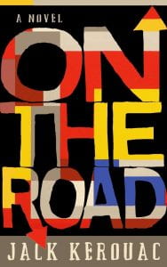
When I first read On the Road,I was sixteen years old. I had just gotten my driver’s license. With no scarlet Corvette or Alfa Romeo Spider Veloce of my own and the Interstate off-limits, I was reduced to my father’s rusty white Pinto and local thoroughfares. Mentally, Kerouac’s novel lifted the latter restriction. Through its pages, I crisscrossed the US, experiencing all of the romance, glory, and freedom of the highway minus the nausea, boredom, and filthy restrooms. A few years later, when I read it again, On the Road so infected me with wanderlust that I dropped out of college and hit the road—not with my father’s Pinto or with an Alfa, but with my thumb. It took another five years and two and a half cross-country trips to scratch the itch planted in me by Kerouac’s second novel. It was that powerful.
By conventional standards, On the Road isn’t a very good novel. Sentimental, repetitive, and with no plot to speak of, as one early reviewer observed, it effectively takes readers on the road, “but it is a road … that leads nowhere.” Apart from Dean Moriarty (the autodidactic character Kerouac based on Neal Cassidy) the rest of the novel’s personae are thinly drawn. Its women are mainly ciphers, as is the narrator, Sal Paradise. The novel’s freewheeling prose (composed, according to legend, on a 120-foot paper scroll in three weeks, though in fact Kerouac wrote it off an earlier draft), has a hypnotic effect. But like most narcotics, it promises revelations that it doesn’t deliver.
But read unconventionally—as it was doubtlessly meant to be read—On the Road is a stunning performance. No need to take my word for it. Google “Steve Allen” and “Kerouac” and watch the YouTube video of the author reciting the end of On the Road as Allen tickles the ivories on his piano. At its best, On the Road is meant less to be read than to be sung—or not sung but wailed on a tenor sax. It’s about as close as words will ever come to improvisational jazz.
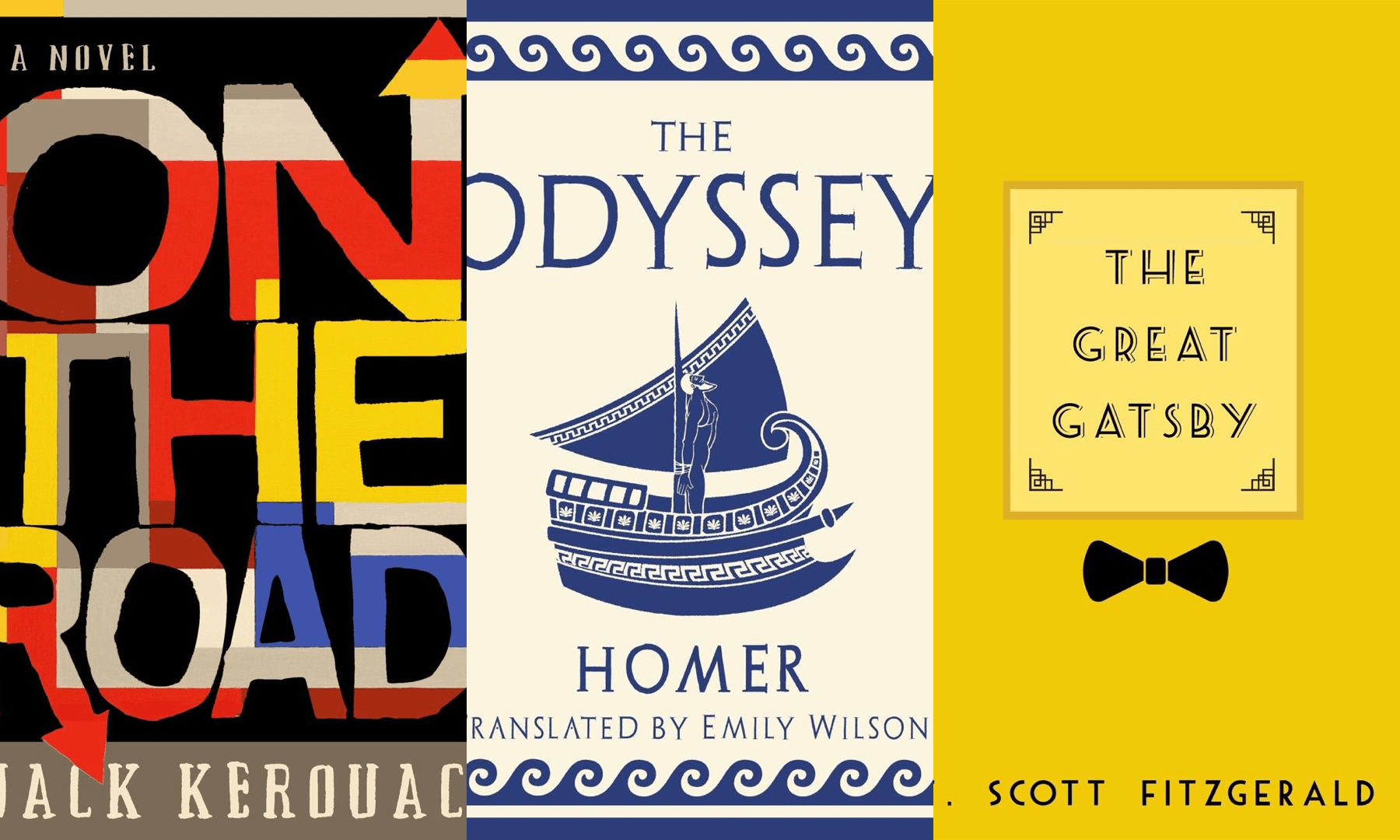
Hence my “jazzy” cover, which owes something to the original Viking hardcover, designed by Bill English featuring a small geometric abstract illustration in red, white, and blue on an austere field of pure black. For my cover, I kept the black background, which fills the negative space carved out by the title’s hand-drawn, closely-packed, primary-hued letters—jazzy bright notes in a dark smoky nightclub. If the novel’s main theme—movement for its own sake— is expressed at all, it’s by those arrow tips appended to two of the letters. If those indicators are too subtle, it’s okay with me, since as far as I’m concerned, On the Road is as much or more about jazz as it is about travel.
If you came of age around the time I did, the two great African American novels were Richard Wright’s Native Son and Invisible Man by Ralph Ellison. If James Baldwin didn’t make the cut, it’s because Baldwin wasn’t at his best in the novel form. Though it had been around longer than the other two novels, as of 1975, Zora Neale Hurston’s Their Eyes Were Watching God had only just been rescued from critical purgatory. Richard Wright was among its harshest critics, accusing Hurston in his review for The New Masses of pandering to racist stereotypes. Alice Walker had yet to publish The Color Purple, her finest novel, and Toni Morrison was just starting to make her mark as a serious literary novelist and remained to be canonized.
It may be sheer fancy, but I suspect that back around 1975, young book lovers like me divided neatly between fans of Invisible Man and fans of Native Son, with the twain rarely meeting. For me, hands-down it was Native Son, the story of Bigger Thomas, whose fate plays out metaphorically in the novel’s first pages, wherein a rat is pursued, cornered, and crushed to death with the heel of a shoe by the novel’s protagonist who has no idea that he is his own executioner. From the rude awakening of a clock alarm going off with which it opens, to the “faint, wry, bitter smile” on Bigger’s face as the caged door of his death row cell slams shut, Native Son is wall-to-wall drama (or, as some critics had it, melodrama).
If Native Son’s M.O. is drama, Invisible Man’s target is satire. Though its theme and underlying message are serious, the story itself is anything but earnest. Except for Mark Twain, what American fiction writer has served up sassier satire than the scene in which the novel’s unnamed protagonist—employed by the Liberty Paint Factory, whose claim to fame is a superior brand of “pure” white paint (“Optic White”), the whitest in the world—learns the secret as it is revealed to him in the following exchange between him and a fellow employee tasked with showing him the ropes:
“…[P]ut in ten drops of this stuff,” he said. “Then you stir it ‘til it disappears. After it’s mixed you take this brush and paint out a sample on one of these.” He produced a number of small rectangular boards and a small brush from his jacket pocket. “You understand?”
“Yes, sir.” But when I looked into the white graduate I hesitated; the liquid inside was dead black. Was he trying to kid me?
“What’s wrong?”
“I don’t know, sir . . . I mean. Well, I don’t want to start by asking a lot of stupid questions, but do you know what’s in this graduate?”
His eyes snapped. “You damn right I know,” he said. “You just do what you’re told!”
“I just wanted to make sure, sir,” I said.
Invisible Man’s satirical nature, together with its loosely-structured, picaresque, rogue’s progress plot best explains why at fifteen the novel failed to catch fire with me. Bugs Bunny cartoons and MAD magazine notwithstanding, satire requires more sophistication than most adolescent boys can claim, and I was no exception. Invisible Man’s layered ironies were lost on me, as was its considerable wit. Still, I loved the prologue that begins, “I am an invisible man,” and goes on to describe the underground chamber in which the narrator has taken refuge from American society—a burrow festooned with hundreds of bulbs illuminated with wattage pilfered from “Monopolated Light.”
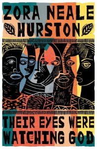
Since I’ve alluded to it, I guess now is as good a time as any to present my cover for Their Eyes Were Watching God, Zora Neale Hurston’s second and most celebrated novel. Written in 1936 when she was forty-five and published a year later, though now consistently ranked among the best English language novels, when it first appeared, Hurston’s book was poorly received. As Hurston herself notes in her autobiography Dust on the Tracks, a good part of the blame for the novel’s initial critical and commercial failure can be laid at the feet of her unwillingness to contextualize her all-black cast as victims of segregation and racism. While novels like Native Son and Invisible Man found their raison d’être in white oppression, in Hurston’s novel white people and their prejudices occupy roughly the same space as mammary glands on a bull.
At first not only was Hurston’s novel dismissed or ignored, to some measure it was condemned mostly by fellow African American authors like Richard Wright, who felt that by not directly or even obliquely confronting racism, Hurston had not only abdicated their cause, but injured it by suggesting that Jim Crow wasn’t such a big problem for black folk after all, but that they had other fish to fry. Asked why she hadn’t confronted race in her novel, Hurston replied, “Because I was writing a novel and not a treatise on sociology. … I am not interested in the race problem, but I am interested in the problems of individuals, white ones and black ones.”
Ironically, Hurston’s refusal to participate in what she called the “sobbing school of Negrohood,” to which most of her fellow Harlem Renaissance writers were committed, resulted in her and her work being marginalized by leaders of the so-called “New Negro Movement.” Her refusal to write about discrimination caused her to be discriminated against. It’s reassuring to know that Hurston lived long enough to see her novel survive most of its dutifully polemical—and duly forgotten—brethren. Politically motivated authors take note!
And though Hurston’s novel doesn’t take racial discrimination as its theme, it dramatizes another form of suppression: the objectification and subordination of women by men. Indeed, it has been argued that through the cruelties and injustices inflicted on women by men in Hurston’s novel, racial discrimination is represented by proxy with the inequities visited upon the novel’s men in the hidden white world beyond the novel’s scope imported into it in the form of domestic abuse and other strains of sexual mistreatment. If Their Eyes Were Watching God dropped the ball on racism, it scored a goal for feminism at least in the black community.
For my cover design, I had in mind two things: a wood– or linocut print of black faces (preferably women’s) and a bright earthy color scheme. The color scheme was no problem; Adobe Illustrator would supply me with all the colors I needed. The print was another matter. I set about searching online. As luck had it, I found the perfect image: a linocut of five African or African-American women, seen from the neck up and grouped tightly together. Titled “Faces á la Picasso,” it’s the work of African-American artist Margaret T. Burroughs (1917-2010).
In addition to her work as an artist, Burroughs was an educator and a prolific author of books and articles especially for black children, to help them appreciate their cultural roots while increasing their awareness of art. In the early 1950s, she founded Chicago’s Lake Meadows Art Fair. She was also co-founder of the DuSable Museum of African American History in Chicago, Illinois.
The print I found (whose appearance online is courtesy of the University of Chicago’s Smart Museum of Art) was signed in 1993. It is owned by a private collector.
Published by Scribner’s in 1926, the first edition featured a Hellenistic jacket design illustrated by Cleonike Damianekes. The illustration, printed in a medley of beiges and browns, depicts a loosely-robed, exhausted-looking woman inclined against an even more tired-looking tree. Her head is resting on her shoulder, her eyes closed, both shoulders and one thigh exposed, cupping a golden apple in one hand, and a pan’s pipe resting by her sandaled foot.
What this image has to do with the plot of Ernest Hemingway’s The Sun Also Rises, let alone with its characters (who have as much in common with classical Greece as The Three Stooges) is anyone’s guess. But Hemingway’s editor, Maxwell Perkins, felt that the illustration “breathed sex” and would therefore appeal to female readers. Whether owing to this or not, the first print run of Hemingway’s first novel—5090 copies —sold out within two months. Subsequent larger runs sold out even faster.
The plot of Hemingway’s novel can be summed up thusly: a group of expat louts travel to Spain from Paris to run with the bulls in Pamplona. Lest you take umbrage at my characterization of the novel’s dramatis personae, a recent nonfiction book by Lesley Blume that unravels the real story behind Hemingway’s novel is titled Everybody Behaves Badly.
In fact, the novel began its life as, if not a memoir, something very close to one. An early draft version of the narrator character who would become Jake Barnes was named “Hem” while other characters bore the names of their true-life counterparts. And if the final draft exemplified Papa’s “iceberg theory” (“The dignity of movement of an ice-berg is due to only one-eighth of it being above water;” i.e., the less said and the more implied the better), it was largely thanks to F. Scott Fitzgerald, who, having read the draft manuscript, persuaded him to cut the other seven-eighths.
Many consider The Sun Also Rises Hemingway’s best work. Had Hemingway been half as good a novelist as he was a short story writer, that would be an even more impressive claim. Anyway, it’s a powerful novel, the sort of novel that burns its descriptions into your senses while forever changing your view of certain things. Among such descriptions is this one that finds the narrator fly fishing in Spain’s Irati river:
… I hooked another and brought him in the same way. In a little while I had six. They were all about the same size. I laid them out, side by side, all their heads pointing the same way, and looked at them. They were beautifully colored and firm and hard from the cold water. It was a hot day so I slit them all and shucked out the insides, gills and all, and tossed them over across the river. I took the trout ashore, washed them in the cold, smoothly heavy water above the dam, and then picked some ferns and packed them all in the bag, three trout on a layer of ferns, then another layer of ferns, then three more trout, and then covered them with ferns. They looked nice in the ferns, and now the bag was bulky, and I put it in the shade of the tree.
—a description so solidly organic you can shuck out its insides. And notwithstanding Gertrude Stein’s contention that “remarks are not literature,” there are quite a few formidable ones aired by Mr. Barnes, to wit: “I mistrust all frank and simple people, especially when their stories hold together”—which alone is worth the price of admission.
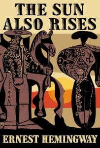
For my cover, I engaged the help of a compact, fiery-eyed, adamantine Andalusian artist named Pablo Picasso. Dating from 1962, the colored linocut print (full Spanish title: “Picador et Torero Attendant le Paseo de Cuadrillas”) shows a picador and a matador in their suits of lights astride a horse. Though otherwise unaltered, I enhanced the background with some vertical bands of color and a setting (or rising) sun. The image struck me as fitting in more ways than one as Hemingway and Picasso seem to have been, as it were, made for each other. Both occupied the avant garde of their disciplines, both drank a lot, and both were supreme womanizers. They were cruel SOB’s who projected themselves into the bullring: Hemingway as the matador, Picasso as the bull. Finally, the less one knows about each, the better for their art.
Should Mr. Picasso’s heirs see my cover, and should they object to my doctoring the master’s work, they may take some comfort in the fact that this cover will in all likelihood never be used. Nor have I been compensated by so much as a nickel for it, so there’s no point in suing me.
Who was Homer? Though his name appears on the cover of every edition of the second-oldest extant work of Western literature (the oldest being The Iliad, likewise attributed to him), no one really knows. The supposedly blind bard from Ionia is no less a legendary and mythic figure than Buddha or Christ, though about the latter two we know much more.
Though every college sophomore is familiar with The Odyssey’s famous prequel, few are aware that it had a sequel. Unlike its two predecessors, however, the Telegony isn’t attributed to Homer, but to the one Cinaethon of Sparta. Nor does it exist apart from a few fragments.
As to whether Homer actually wrote either or both of the first two epics, that’s the subject of a long-standing scholarly dispute with some ascribing both creations to a single author, and others holding that the poems arrived at their final forms through countless revisions and elaborations made by many contributors over decades if not centuries. For all we know, The Odyssey has as many authors as the Bible or (according to some) Shakespeare’s oeuvre, while “Homer” may be as much of a contrivance as The Monkeys.
Complicating matters further is the fact that there’s no one “Odyssey”—at least not for those of us who can’t read Homeric Greek, let alone the poetic dialect in which its over 12,000 lines of dactylic hexameter were originally transcribed. Instead we have (at last count) seventy-five English translations, in prose and verse (including one by T.E. Lawrence, aka “Lawrence of Arabia”), so your Odyssey may be unrecognizably different from mine.
For my book cover I chose a very recent translation, the first ever in English by a woman, a young British classicist named Emily Wilson. Her version of The Odyssey begins:
Tell me about a complicated man.
Muse, tell me how he wandered and was lost …
Wilson’s choice of the word “complicated” is telling. In the original Greek, the word used to characterize the epic hero is πολuτροπον or polytropon, with the prefix poly meaning “many” or “multiple,” and tropon meaning “to turn” or “turned,” suggesting that Odysseus has returned from the war a “turned” or transformed man of complex character. But while other translators have used “resourceful,” “versatile,” “restless,” “ingenious,” “man of many wiles,” and “endlessly cunning” to characterize him, Wilson chose “complicated,” a word conveying cautionary praise or softened censure, thereby, by a single stroke, establishing Odysseus as an ambivalent, ambiguous hero.
For my color scheme, I chose a stark palette of blue and white, the colors (more or less) of the Greek flag, which itself conveys the sun-bleached starkness of an Augean island. The figure of Odysseus lashed to the mast of his ship I appropriated from the ancient pottery vase known as The Siren Vase, now in the British Museum. The font is called, fittingly, “Archeologicaps.”
Soon after seeing the jacket art for what would be his most famous novel (really a novella, if you want to get technical about it), F Scott Fitzerald wrote a letter to his editor, Maxwell Perkins, on August 5, 1924 beseeching: “For Christ’s sake don’t give anyone that jacket you’re saving for me.”
The artwork in question depicts a woman’s eyes and lips floating on a cobalt blue sea that forms the night sky. The image looms over what, with its fanfare of bright colored lights, looks like Coney Island or a carnival. In place of an iris, each heavily made-up eye holds a miniature, Matisse-like reclining nude. The lips are heart-shaped, bright red, and preternaturally small according to the epoch’s concept of feminine beauty.
The illustration was the work of a commercial artist from Barcelona named Francisco Coradal-Cougat, Francis Cugat for short. Like the novel whose cover it would adorn, it was destined to be its creator’s most celebrated creation.
Though you might assume, as others have that Cugat’s illustration took its cue from the novel’s description of a pair of giant, faded-blue, bespectacled eyes peering out over the Valley of Ashes from a billboard notice promoting the ophthalmological services of a Dr. T.J. Eckleburg (which in turn are said to symbolize the eyes of God looking down in judgment on decadent American society), it is more likely the image refers to an utterance by Nick Carraway, the novel’s narrator, at the end of Chapter IV: “Unlike Gatsby and Tom Buchanan, I had no girl whose disembodied face floated along the dark cornices and blinding signs [of New York City by night].”
Not everyone felt as strongly about the image as Fitzgerald. As recalled in A Moveable Feast, when Ernest Hemingway first saw the cover, he thought it was garish and better suited for “a bad science fiction novel.” This of course is the same Hemingway who, as time went by, had ever fewer nice things to say about “poor Scott”—or anyone else who had ever done him a good turn. On the other hand, Fitzgerald’s own feelings about the Cugat cover can’t necessarily be trusted either, not when you consider that the same man who wanted it for his novel also wanted to name that novel “Trimalchio in West Egg.”
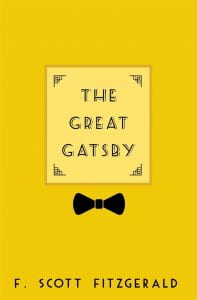
Though I like Cugat’s original cover, for my own design, I took an entirely different direction, namely: yellow. Chalk it up to a case of “literary synesthesia,” but to me The Great Gatsby is, always has been, and always will be a yellow novel. That’s the color that instantly fills my mind whenever I think of it or its title: a rich warm buttery yellow.
And just what, you ask, has “yellow” got to do with the story of J. Gatsby? Well, though it’s described by the coffee shop owner Michaelis as “light green,” Gatsby’s car (which depending on which authority you appeal to, is either a Rolls Royce or a Duesenberg), the so-called “death car”—the one that, with Daisy Buchanan at the wheel, strikes and kills Myrtle Wilson—is yellow. In fact, yellow—not green, as you might expect (the color of that pulsing light on the end of Daisy’s dock) —is the most frequently occurring color in the novel. Dr. Eckleberg’s enormous spectacles are yellow, as is the “golden” necktie Gatsby wears the first time he meets Daisy at her home. At his parties, according to Nick, Gatsby plays “yellow cocktail music.” Daisy is herself described as a “golden girl.” In its golden state, yellow is, of course, also a symbol of luxury and great wealth.
I am not alone in seeing yellow when I think of Gatsby. No fewer than a half-dozen previous covers have been yellow, including one featuring a giant dollar sign, one with a string of pearls, one with a daisy (not the character: a flower), one with the front grill of a Duesenberg (or a Rolls Royce), and one depicting a man—presumably Gatsby—wearing a suit and reclining in a chair, his top half in shadow as he sleepily contemplates a half-empty (or half-full) martini glass.
For my own yellow Great Gatsby cover, I wanted to avoid overt representations of characters or objects. Just the title in an art deco font on a yellow field. My one concession to representation is a black bowtie I added at the last moment with the title occupying roughly the place where the bowtie-wearer’s head would be.
Fitting, I think, given Gatsby’s distinction as the greatest cipher ever produced by literature. A protagonist who exists—to the extent that he exists at all—primarily as the ideas that other people have about him, and that he does nothing to discourage. Hence The Great Gatsby, our great American novella, is a doughnut with Gatsby as the hole in its center.
His Mother Smells Like Hairspray by Megan Clark
Just because she
chose
to go drinking
instead of tucking you in
each night
does not mean
you're unworthy of love,

and the fact
your most prominent
memory
is her AquaNet lingering
near the foyer bathroom
tells me that you'll know
how to be better.
Megan Clark graduated from Towson University in 2018 with her degree in English (creative writing concentration). She lives in Harford County with her soon-to-be husband and their Jack Russell Terrier, Rudy.
The Perfect Grub Street Read Based On Your Zodiac Sign
Logan Furness, 2018-19 Online Poetry Editor
Grub Street’s newest edition is soon to reach campus and with so many great works inside, it can be overwhelming to pick where to start your literary journey. Luckily the stars have aligned to lead you to your perfect read. Obviously we can’t give away too much, but these pieces are sure to get you excited for the launch of volume 68.
Aquarius (1/20-2/18) [After my husband died, I did not ] by Tim Neil
This is not your average elegy poem. Neil’s words captured our poetry team. Join us in our obsession with this poem!
Pisces (2/19-3/20) Adam’s Rib by Eva Niessener
Niessner’s essay dives into the origins of names, the tales of childhood, and the grieving of a family after losing a child.
Aries (3/21-4/19) Falling by Christina Yang
This short story follows the relationship of the Michelle and Doug while Michelle learns about herself through her relationships with her parents, her sister, Doug, and her worm farm.
Taurus (4/20-5/20) Internet Dating, Day 16 by Josh Lefkowitz
Lefkowitz’s poems (see also “America’s Most Misspelled Words”) bring a humorous take on life and the phenomenon that is swiping through selfies and bios in search of love.
Gemini (5/21-6/20) Ubuntu by Andi Mclver
Although it is one of the longer pieces in the journal, it reads quickly due to the sectioned memories through which the story is told. Mclver reflects on her life in South Africa as a white woman in a racially-divided climate.
Cancer (6/21-7/22) Send Me Something Sexy by Shayna Goodman
This essay explores how dating someone can distort your image of yourself and the miscommunications, vulnerabilities, and self-realizations that come with dating (and breaking up) in college. Goodman captures readers’ hearts and attention with this relatable and captivating work.
Leo (7/23-8/22) Sheetrock by Cameron Morse
This poem is endearing as the speaker contemplates how cancer will affect those closest to them.
Virgo (8/23-9/22) Things We Might’ve Called Crazy by Sally Leaf
Leaf’s montage of butterfly facts and her descriptions of college life as a young adult coping with mental illness is beautifully intriguing, pulling at your emotions one minute and then having you smile to yourself as you turn the page.
Libra (9/23-10/22) Carmelita by Alison Hazle
This poem gives a sense of longing nostalgia for a person you can no longer enjoy the intimate moments of life with. Be sure also to check out the other poems published by Hazle in volume 68 of Grub Street.
Scorpio (10/23-11/21) Zion in El Salvador by E.E. Rodriguez
We get a taste of Latin American culture with Rodriguez’s mixing of Spanish and English lines, and the strong images make you feel even more connected to the poem.
Sagittarius (11/22-12/21) The View From Here by Emily Brisse
Brisse reflects on how privilege has given her amazing opportunities, such as a spring break trip building houses for families in need; yet, it has also blinded her from seeing some of life’s consequences.
Capricorn (12/22-1/19) Gulfs by Natalie Lyalin
Lyalin creates impeccable imagery with this piece about all the things left unsaid.
Middle Earth by Robert Beveridge
Lower the boom, lower the cheese, lower
the flag and see who still salutes. Pieces
at half eight, a basket in the Presidential
rose garden, unsure which restroom is safe
or desirable. You find you can dip pretzels
in anything once you’ve had a couple
of joints and they still taste good. Breast
milk took some getting used to, but now
you favor it over ranch (the houses,
not the dressing). Keep pushing your shark
to level up, he slacks off on his training
regimen every time a Wapner rerun shows
up on the tube, but he responds well
to rewards of Jarlsberg, Limburger, Stilton.
Robert Beveridge (he/him) makes noise (xterminal.bandcamp.com) and writes poetry in Akron, OH. Recent/upcoming appearances in The Virginia Normal, Credo Espoir, and Chiron Review, among others.
Thanks!
